
BichotaBoss
Redefining self-defense with style.
Personal Branding & Packaging Design
Industry: Personal Safety / Lifestyle
Programs Used: Adobe Illustrator · Adobe Photoshop · Adobe Lightroom · Procreate
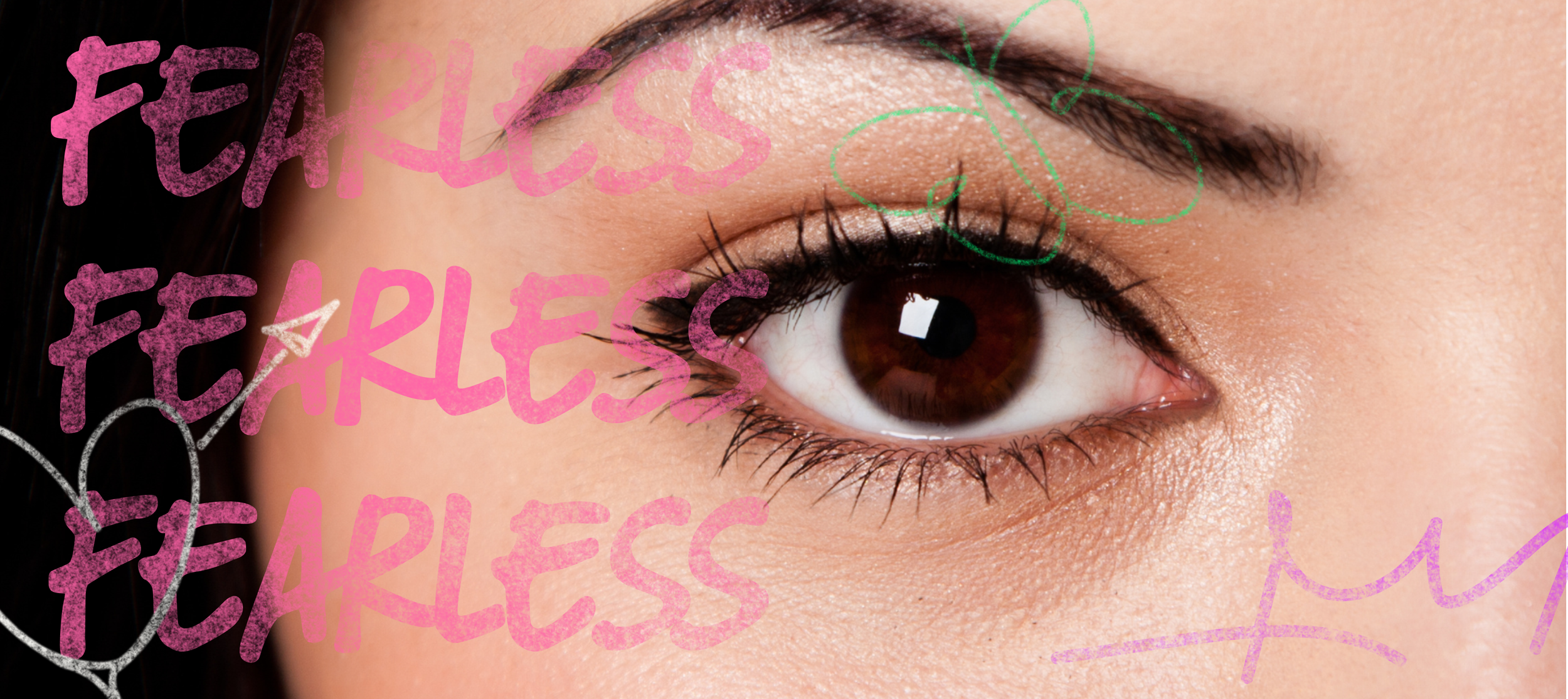
Bichota Boss is a personal branding project inspired by Karol G’s empowering idea of being a “Bichota” a woman who is strong, confident, and in control. The project reimagines pepper spray as something stylish and bold, celebrating protection as an act of empowerment rather than fear. Most self-defense products are designed with a generic or masculine tone, creating little emotional connection with the women who use them. Bichota Boss challenges that norm by turning protection into an act of self-expression bold, stylish, and fearless.
Target Audience
Designed for women who care about safety and self expression.
Bichota Boss was created for women who want protection that reflects their personality and lifestyle. It speaks to people who value confidence, creativity, and independence women who see design as part of who they are and want to carry something that feels authentic, not hidden or generic.I experimented with layout, proportion, and type placement to balance personality with clarity. The backing card design highlights the character illustration while keeping important product information visible and easy to read. Each label color connects to the overall identity system but still feels unique, creating a small collection that is cohesive and expressive.


Creative Process
Exploring bold visuals and empowering color direction.
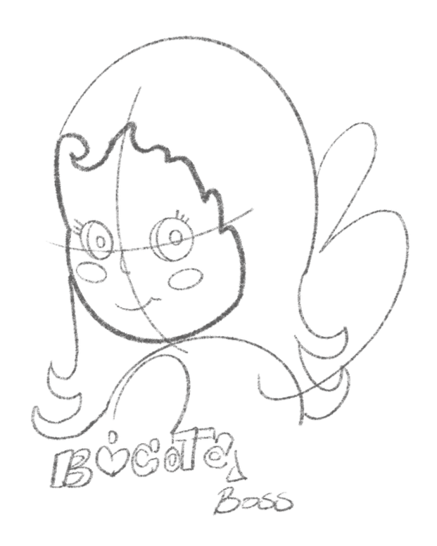
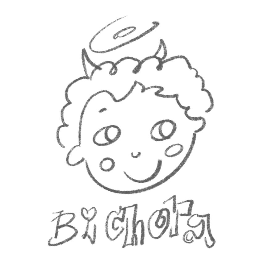
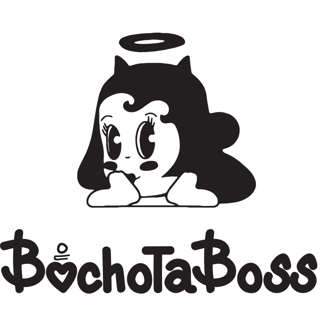
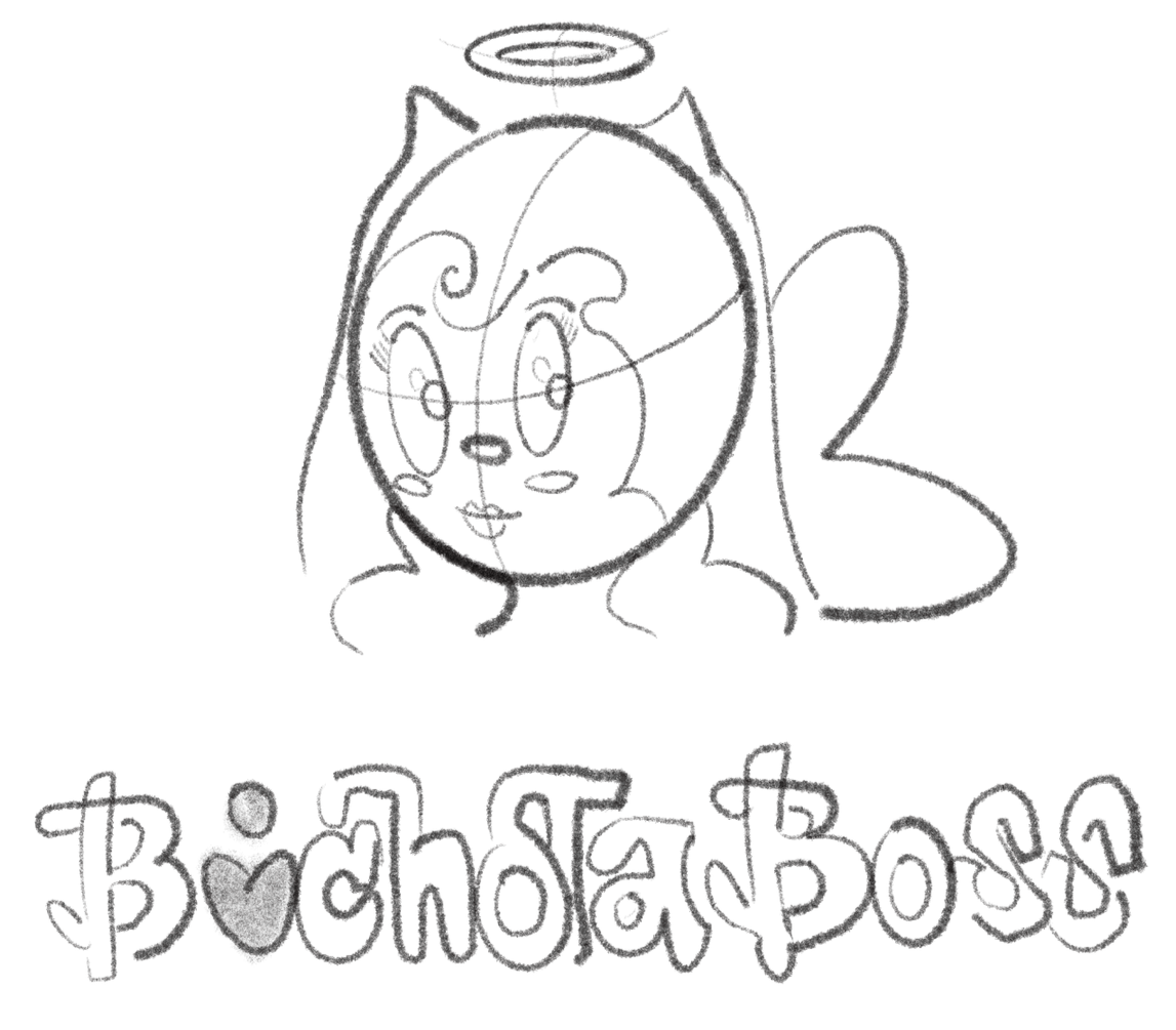
I explored bold illustration styles and playful typography inspired by Karol G’s Bichota concept of strength and confidence. Through early sketches, I focused on defining a character that felt powerful yet approachable, developing an expressive style that merges attitude with femininity. I also experimented with color combinations beyond pink, using rich, vibrant tones to represent the diversity and individuality of all women.

Challenge & Creative Direction
Turning protection into something you actually want to carry.
Designing the packaging was one of the most challenging parts of this project. I wanted it to look playful and bold while still feeling functional and realistic for a retail setting. The goal was to make the pepper spray feel like an accessory rather than a weapon, something that people would proudly keep in their bag or on their keys.
I experimented with layout, proportion, and type placement to balance personality with clarity. The backing card design highlights the character illustration while keeping important product information visible and easy to read. Each label color connects to the overall identity system but still feels unique, creating a small collection that is cohesive and expressive.


