El Caribe Foods
Celebrating the flavors of the Dominican Republic.
Brand Identity, Packaging, and Website Design
Industry: Food and Beverage
Programs Used: Adobe Illustrator, Adobe Photoshop, Adobe Lightroom, Squarespace, Figma
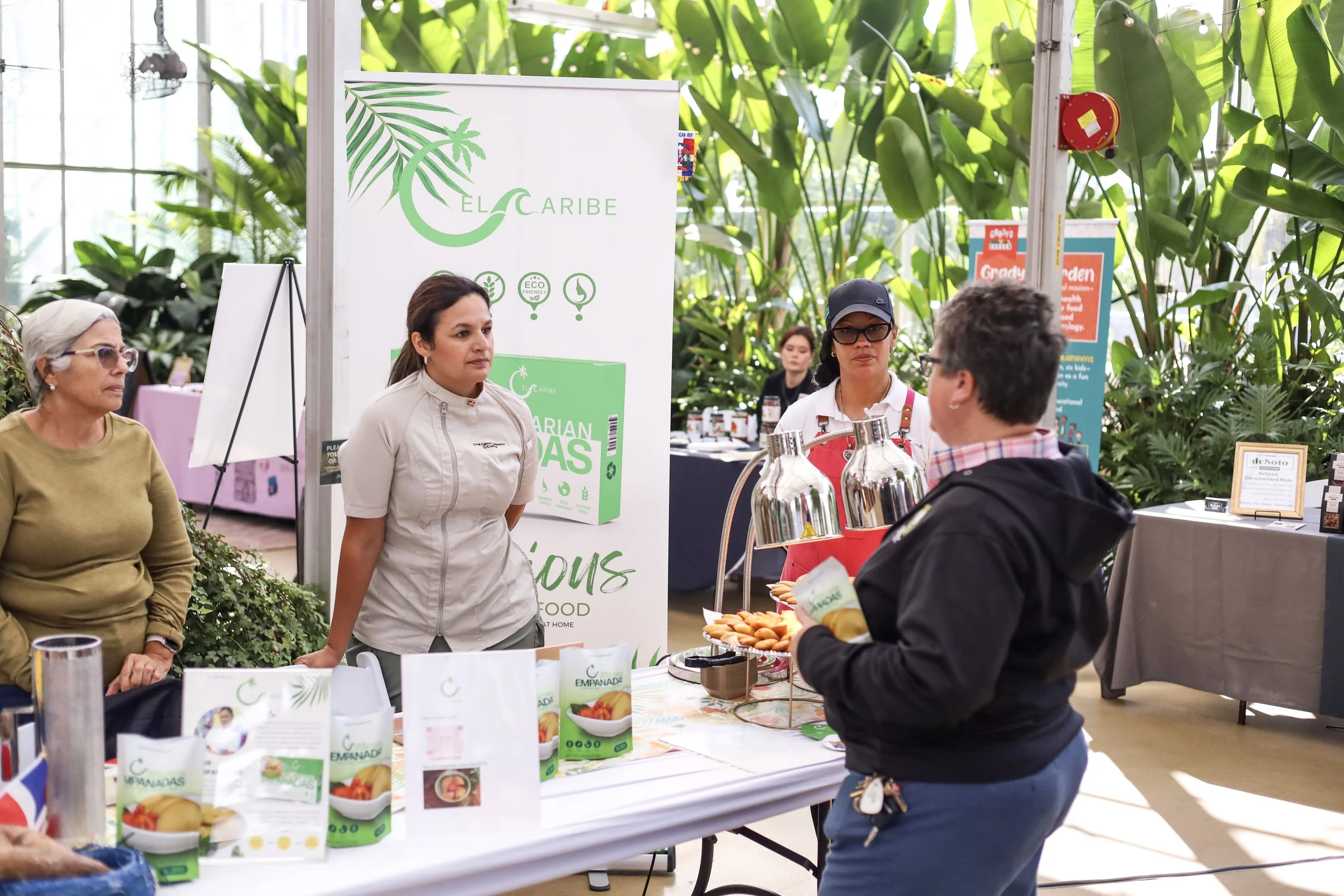
I collaborated with Chef Gilma De La Cruz to develop the brand identity for El Caribe Foods, a Latina owned business inspired by the vibrant food traditions of the Dominican Republic. Now available in Meijer stores, the brand brings authentic Caribbean flavor to a wider audience. The goal was to create a visual identity that feels genuine, welcoming, and full of life, one that reflects the colors, textures, and energy of Dominican culture. Every design decision, from the logo to the packaging and website, was guided by the idea of sharing warmth and connection through food, capturing the same spirit that defines Chef Gilma’s recipes and story.


Creative Process
Exploring rhythm, flavor, and cultural identity.
The process began with sketches inspired by the warmth and movement of Caribbean culture. I wanted the logo to capture that spirit in a way that felt light and approachable, using the letter “C” to reflect both the shape of ocean waves and the leaves of a palm tree.
Because El Caribe Foods offers a healthier take on traditional Dominican dishes, the visual direction also needed to feel clean and modern. I focused on balance, open space, and simple typography to communicate freshness and trust while keeping the brand’s energy and cultural roots at the center.

Target Audience & Social Media
Connecting culture and community through food.
El Caribe Foods was created for people who love authentic flavor and value real, homemade food. The brand speaks to families, young professionals, and food lovers who enjoy discovering new cultural experiences while still caring about fresh, high quality ingredients.
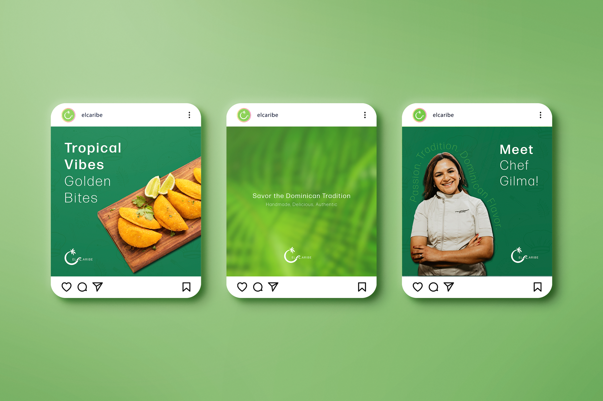
On social media, the focus is on sharing warmth and storytelling, celebrating Chef Gilma’s journey, showcasing the vibrant colors of Dominican cuisine, and highlighting the craft behind every empanada. Each post combines clean layouts with natural textures and inviting photography to express the brand’s personality: honest, modern, and full of flavor.


Website Design
A digital space that brings the brand and story to life.
El Caribe’s website was designed to be clean, intuitive, and welcoming, allowing users to easily explore the brand and its products. The layout introduces Chef Gilma’s story and highlights the brand’s cassava based, gluten free empanadas in a simple and approachable way.
The design uses bright visuals, clear calls to action, and concise content to reflect the warmth and authenticity of the brand. Beyond showcasing the products, the site invites visitors to connect with the culture, values, and mission of El Caribe, creating a digital experience that feels personal, inspiring, and full of heart.
Packaging Design and Photography
Highlighting freshness, flavor, and authenticity.
The packaging was designed to look clean and modern, reflecting the brand’s position as a healthier, cassava based alternative to traditional empanadas. The layout emphasizes clarity and trust, with soft gradients, minimal icons, and a natural color palette that brings out the freshness of the ingredients. The design balances cultural warmth with simplicity, making it approachable and ready for retail shelves.
As the product photographer, I focused on capturing the same warmth and authenticity present in the brand. Each shot was styled to highlight texture, color, and freshness, showing the empanadas as both inviting and real. The images play a key role in storytelling across packaging, web, and social media, helping El Caribe feel consistent and true to its identity.


Challenge & Creative Direction
Balancing tradition with a modern identity.
One of the main challenges was finding the right balance between representing Dominican culture and creating a brand that felt modern, healthy, and ready for retail. Many Caribbean food brands rely heavily on bright and busy visuals, but I wanted El Caribe to stand out with a clean and minimal design that still felt warm and approachable.
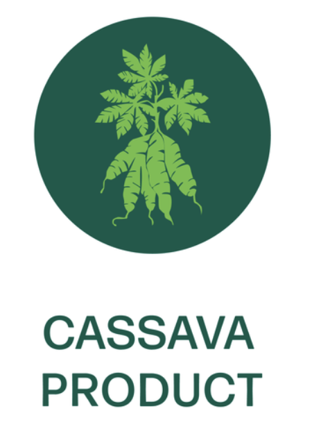
I focused on simplicity, clear typography, and natural colors to communicate freshness and trust. Each design decision, from the use of cassava inspired graphics to the creation of custom icons, was made to highlight what makes the brand unique: a gluten free, eco friendly, woman owned business that celebrates Dominican tradition with a contemporary look.

Typography
The brand uses clean, modern typography with soft curves to create a warm and approachable feel. Its simplicity allows the vibrant visuals to shine while keeping the overall identity professional, consistent, and easy to read across platforms.

Color Palette
The palette includes three shades of green, white, and a warm brown-gold tone. Inspired by Caribbean ingredients, textures, and landscapes, the colors feel fresh, natural, and rooted in tradition, giving the brand both energy and visual

Graphic Elements
To support the visual identity, I created custom icons and graphic details used across packaging and marketing materials. These elements highlight key product features and add personality, helping the brand feel cohesive, friendly, and recognizable.


