

MATTEL
Rebrand
Growing up, Mattel was a big part of my childhood. I spent countless hours immersed in the joy and creativity their toys brought to life. But as I looked at the brand with fresh eyes, I saw an opportunity to bring it into the modern era while staying true to its iconic roots.
This redesign was about more than just visuals; it was about preserving the magic of Mattel while giving it a brighter, modern twist. The refreshed logo, cohesive brand guide, updated packaging, and engaging social media visuals reflect a softer, more contemporary look that speaks to today’s audience. Every element was crafted to appeal to kids, parents, and gift-givers alike, ensuring Mattel’s playful and timeless spirit continues to inspire for generations to come.


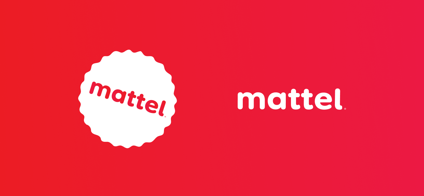
The refreshed Mattel logo balances nostalgia with modernity, preserving its playful spirit while embracing a more contemporary look. The redesign features softer, rounded shapes for a friendlier feel, paired with a brighter red that brings vibrancy while staying true to its iconic hue. Smooth, approachable typography was chosen to complement the logo, creating a design that appeals to kids, parents, and gift-givers alike. Through a thoughtful process of research, sketching, and refinement, the new logo reflects Mattel’s legacy while positioning the brand for a dynamic and inclusive future.


The redesign of Mattel’s visual identity started with in-depth research and the creation of moodboards that combined the brand’s nostalgic charm with modern influences. By exploring Mattel’s history, audience, and competitors, I identified key themes like playfulness, creativity, and inclusivity. The moodboards captured vibrant colors, approachable typography, and softer shapes, serving as a visual guide for the redesign. This foundation ensured every design decision stayed true to Mattel’s legacy while appealing to a new generation of consumers.
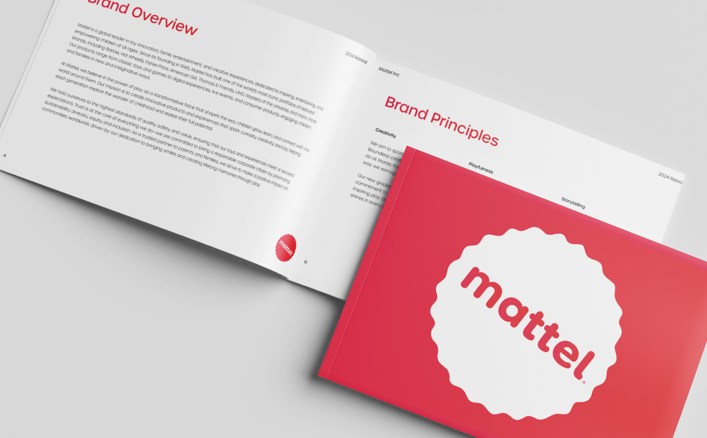
The Mattel brand guide was developed to ensure the refreshed identity stays consistent and easy to apply across all platforms. It provides clear instructions for using the logo, colors, fonts, and other visual elements, helping to maintain a cohesive look and feel no matter where the brand appears.
In addition to design elements, the guide outlines how to use imagery and establish the brand’s tone of voice, ensuring that Mattel’s playful and welcoming personality shines through in every interaction. It also includes examples and tips for creating content that feels modern and aligned with Mattel’s values.
Designed to be both practical and inspiring, the guide serves as a roadmap for bringing the brand to life while staying true to its legacy, giving teams the tools they need to keep Mattel fresh and engaging for its audience.

The rebranding of Mattel was driven by the need to modernize the brand while preserving the playful and nostalgic essence that has made it a household name for generations. As times change, so do the expectations of audiences. Parents, kids, and gift-givers now look for brands that not only deliver fun but also reflect inclusivity, creativity, and a forward-thinking approach.
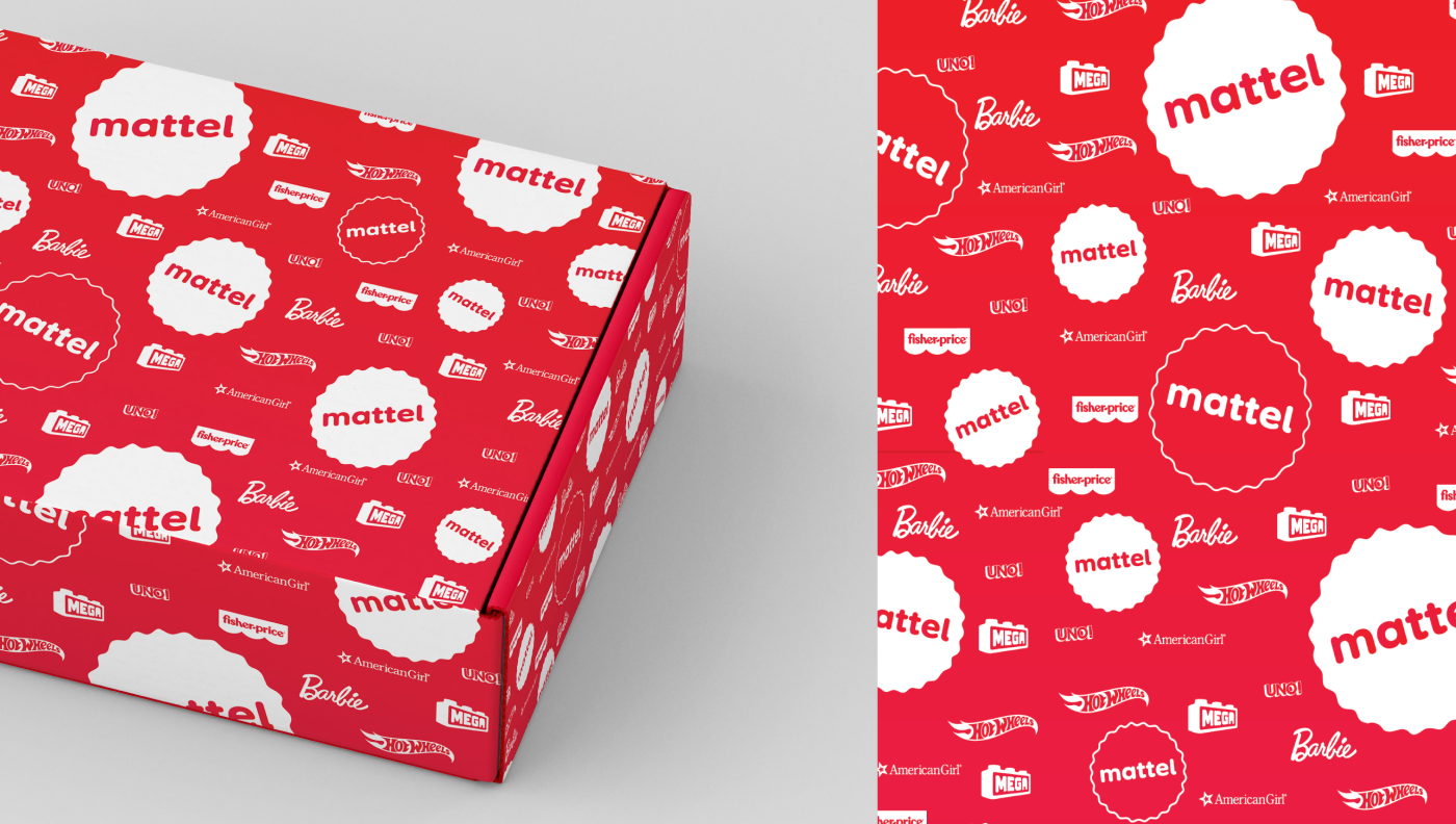
The new packaging for Mattel’s imaginary store was designed to celebrate its iconic brands while creating a cohesive and modern look across all products. From Barbie to Hot Wheels and Fisher-Price, each package highlights the unique identity of the product while tying into the refreshed Mattel branding.
Bold colors, softer shapes, and playful typography bring a fresh, unified feel to the packaging, making it instantly recognizable on shelves. Each design focuses on engaging kids and parents alike, balancing nostalgia for classic brands with the excitement of something new. The result is packaging that not only protects the product but also tells a story, inviting customers into the colorful and imaginative world of Mattel.
