El Caribe Foods
As a freelance designer, I partnered with Chef Gilma DeLaCruz to develop the brand identity for El Caribe Foods, a Latina-owned business inspired by the vibrant flavors and traditions of the Dominican Republic. This project focused on brand storytelling and creating a cohesive, purpose driven visual experience.
I led the design and execution of a complete visual identity system, including a custom logo, packaging design, marketing materials, and a responsive website. Each element was crafted to reflect the brand’s cultural background and connect meaningfully with its target audience.
El Caribe Foods is preparing to launch in Meijer stores next year, and I continue to support the development of new product lines. This branding system gave El Caribe Foods a strong foundation for its launch, with visuals that feel true to its story and ready to grow alongside the business. There is still more to come.


The creation of El Caribe’s brand identity started with research, concept development, and collaboration. Inspired by Chef Gilma DeLaCruz’s vision, I explored ways to reflect the warmth and energy of Caribbean culture through design.
I focused on movement within the typography to capture the lively spirit of El Caribe. After refining several concepts, the final logo features a palm tree and wave, symbols of tradition, flavor, and the Dominican Republic. Together, they create a mark that feels bold, welcoming, and true to the brand’s story.


The brand uses clean, modern typography with soft curves to create a warm and approachable feel. Its simplicity allows the vibrant visuals to shine while keeping the overall identity professional, consistent, and easy to read across platforms.

The palette includes three shades of green, white, and a warm brown-gold tone. Inspired by Caribbean ingredients, textures, and landscapes, the colors feel fresh, natural, and rooted in tradition, giving the brand both energy and visual depth.

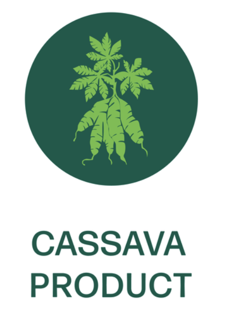
To support the visual identity, I created custom icons and graphic details used across packaging and marketing materials. These elements highlight key product features and add personality, helping the brand feel cohesive, friendly, and recognizable.
The Challenge
Chef Gilma wanted to launch her products in a competitive retail market while staying true to her cultural heritage. The brand needed to feel modern and professional while also warm, flavorful, and connected to her Dominican roots. The goal was to create a visual system that could grow with the business and stand out both on shelves and online.
El Caribe’s empanadas stand out not only for their flavor but for what they represent. The brand is proudly women owned, eco friendly, gluten free, and uses cassava to offer a sustainable, health conscious alternative. The packaging needed to reflect these values while telling a story that honors tradition, celebrates identity, and highlights quality with intention, care, and lasting visual impact.


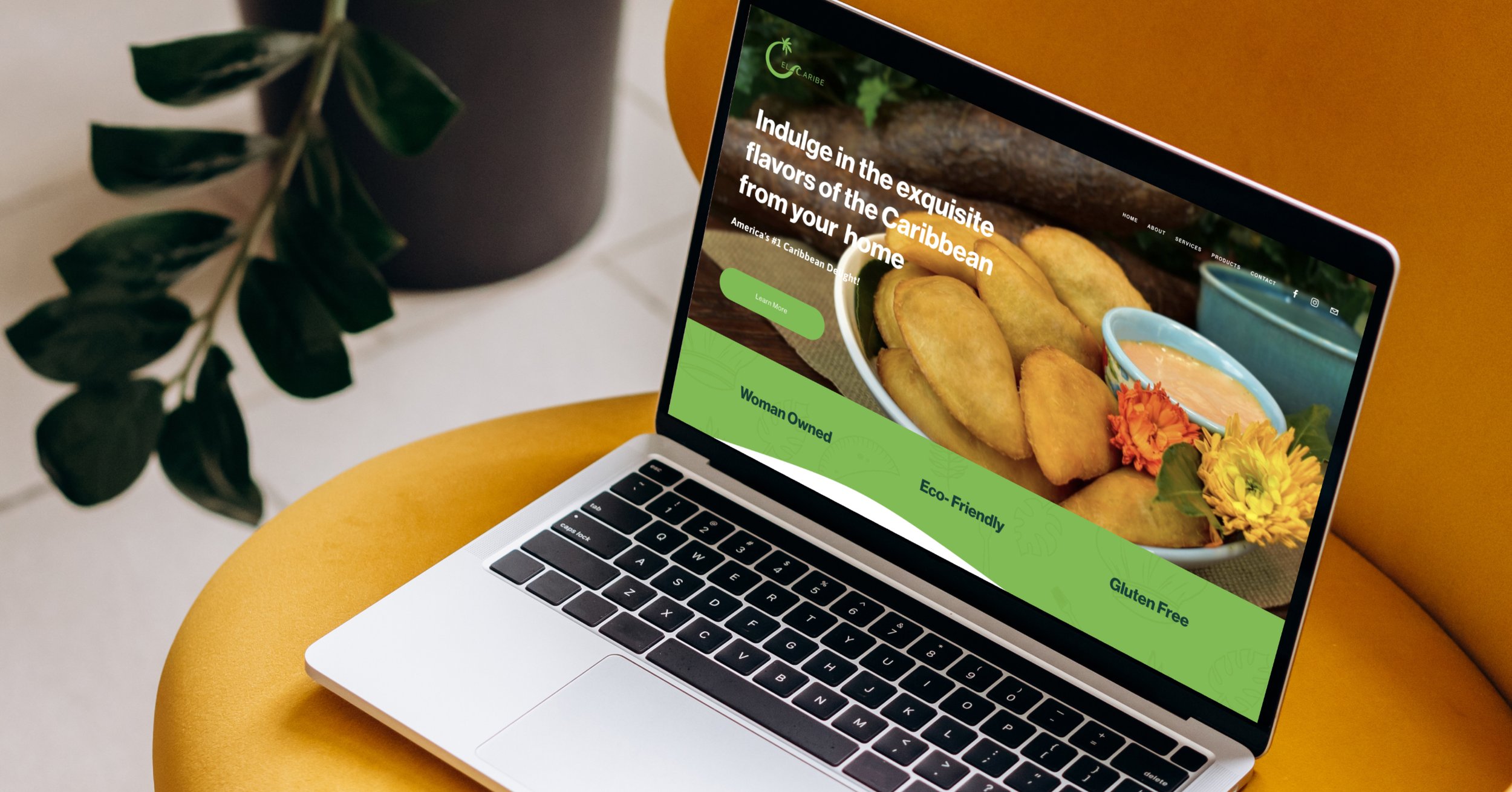
El Caribe’s website was designed to be clean, user friendly, and easy to navigate. It introduces the brand through a simple layout that highlights its cassava-based, gluten-free empanadas and the Caribbean traditions behind them.
Bright visuals, clear calls to action, and concise content help bring the story to life. The site not only showcases the products but also invites users to connect with the culture, values, and mission of El Caribe, creating an engaging and memorable brand experience.
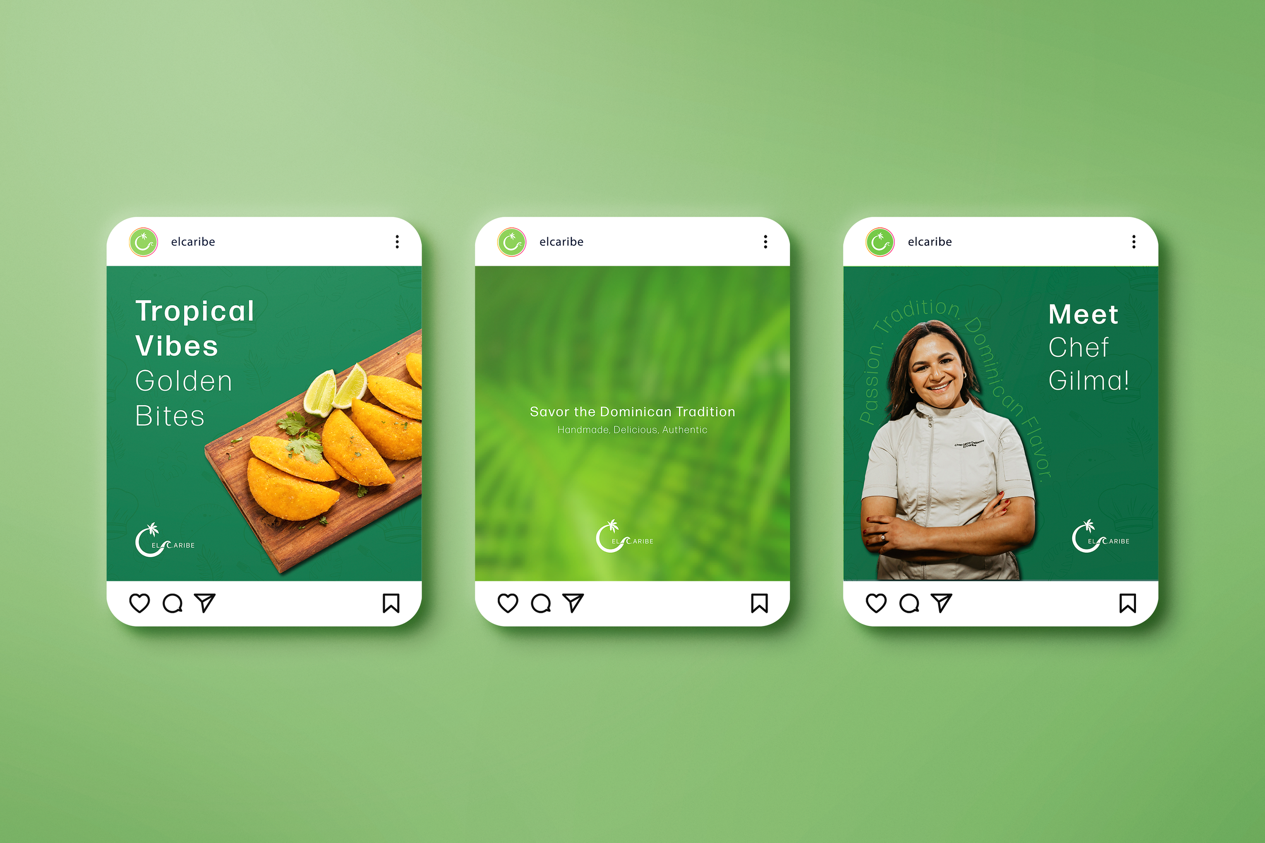
From business cards to Instagram posts and the website, every brand element was designed to feel cohesive, intentional, and engaging. Each piece works together to tell El Caribe’s story and build a consistent experience across platforms.
This thoughtful system ensures that every touchpoint, whether printed or digital, reflects the authenticity and vibrancy of the brand. It captures the essence of Caribbean culture and invites people to experience the rich flavors and traditions Chef Gilma DeLaCruz shares through her food.